
HOET&HOET: Brand Architects
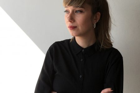
Ronane Hoet, one half of graphic design studio Hoet&Hoet, talks to TLmag about brand identity, storytelling and the importance of listening
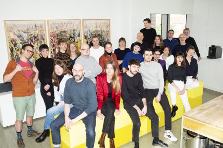
In a cosy, warm, countryside setting in the heart of Walloon Brabant, Ronane Hoet, graduate in typography from La Cambre, and her art historian sister Nick Hoet, together with a talented, multidisciplinary team, have created visual identities for large and small Belgian organisations for nearly 30 years. We met with Ronane Hoet, founder of the studio Hoet&Hoet.
TLmag: You have built visual identities for more than a hundred brands in widely varying sectors including fashion, art, multimedia, decorating, the public sector, etc. Do you ever get dizzy from immersing yourself in so many contrasting universes?
Ronane Hoet: Well, it is certainly motivating. Each new project gets us interested in a new area. Our primary task is to ask questions. Working upstream on our clients’ strategies enables us to build an understanding of their universe, master the codes and, ultimately, create a true differentiation, which is the basis of every successful communication.
This differentiation is expressed, in your case, through a logo or a website design…
We are a graphic design studio, not artists. Our job is to translate a universe, understanding that the sectors that seem the most attractive initially (fashion or design, for example) are not necessarily the easiest to understand. Our mission is to create a new language for our clients.
Today, there is a lot of talk about brand identity. Why do institutions, companies and designers have such difficulty defining theirs?
Most often, it’s because they have not identified with precision their primary motivation. The ‘why’ of their approach. Today, everyone is searching for meaning. When a company understands its motivation, it is easier for the organisation – and thus for us – to generate excitement around their project. But whatever is decided, we must never forget that the final decision – to go in one direction rather than another – belongs to the client. Whilst we can direct them towards certain typography or colour choices that seem appropriate to us, they are the ones who must live with the new image.
And the ‘storytelling’? This is an exercise that brands dread as much as they appreciate. How can you tell an authentic story in a world that is always over communicating?
In most of the cases, the story does not need to be told in its entirety. Sometime, all that is needed is for the message we are trying to express to be perceived, even in fragments. For example, I don’t think all Belfius customers noticed that the new logo we created for the brand is an equal sign (=). For me, that isn’t important: what counts is that the experience we want to share has been felt.
The emotional aspect also plays a big role in our work. In some cases, a logo change can be synonymous with a new internal dynamic. That might not have been the client’s original goal, but it is fundamental for the good operation of the enterprise.
Working with so many organisations must have enabled you to build a pretty precise idea of what will be key to success, wouldn’t you say?
What seems essential to me is listening. I believe very strongly in collective strength. Today, unless you are an outstanding visionary (and even then), you cannot impose things without showing them to your collaborators or external people. In our studio, we work with a team composed exclusively of self-employed co-workers. But that does not prevent us from giving the human aspect centre stage. Without this dimension of sharing and exchange, it is impossible to create quality projects.
When a brand wants to go international, what do you advise them?
With international projects, in addition to legal complications regarding, in particular, copyrights, cultural differences are the main obstacle that can prevent an organisation from finding its place on a new market. A few years ago, we were looking into opening a studio in Hong Kong. But the difference in perception between Chinese customers and ourselves regarding, in particular, the concept of quality, as well as the price war in that market, changed our minds. This experience enabled me to understand that my ambition has a limit. And the limit is enjoyment. I want, whatever happens, to be able to give myself the means to create beautiful projects that I can be proud of.
“Design Generations”, an exhibit carried out in partnership with Wallonie-Bruxelles DesignMode (WBDM), offered your studio the opportunity to question the role you give to ethics and sharing within your activity. Can you explain that to us?
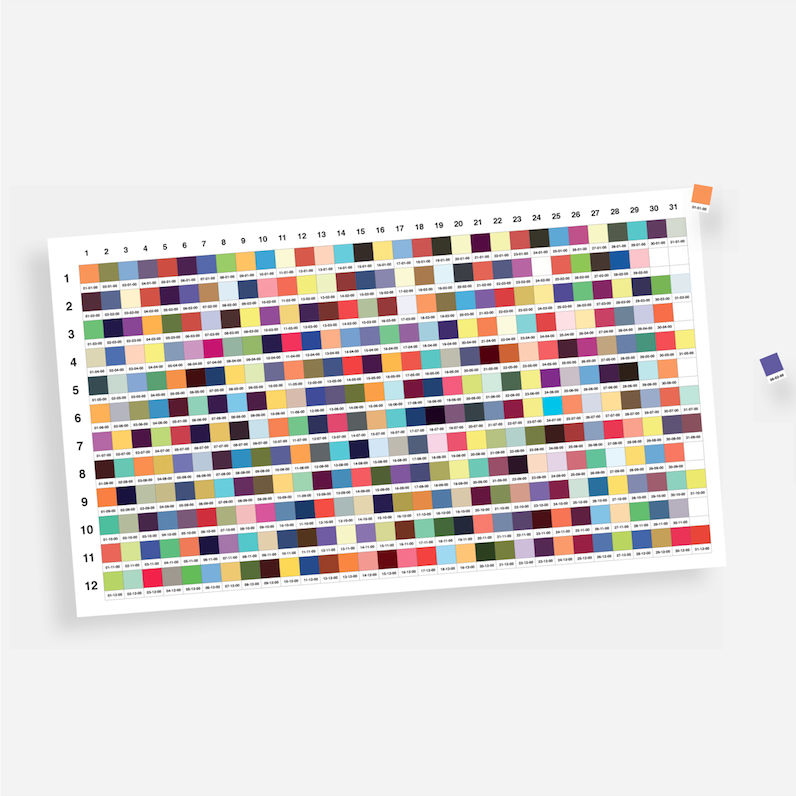
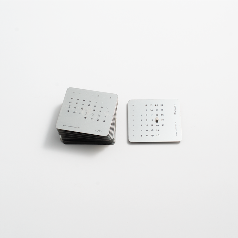
To me, respect for the work of others, in this case our competitors, is essential in a business like ours. This is one of the keys to our longevity. For this exhibit, we were asked to think about the concept of time. Hence our idea to install in parallel a calendar in the museum collections and a – more conceptual – version that we create every year for our customers. The calendar in the museum evokes the symbolism of the planets associated with the different days of the week. For our studio, each calendar is an opportunity to communicate our values to our customers.
“Design Generations”, an exhibit carried out in partnership with Wallonie-Bruxelles DesignMode (WBDM), during the fifth edition of Intersections, around 10 Designers: Alain Berteau, 42|54, IOL, Sylvain Willenz, Luc Druez, Hoet & Hoet, Jean-François d’Or, Kaspar Hamacher, Damien Gernay and Alain Gilles, until 4 November 2018 at ADAM – Brussels Design Museum

Articles you also might like
Having been CEO of leather goods brand from 2012 to 2018, Marco Probst is (since December) once again the happy CEO of his Maison. He guards his secret with Germanic rigour mixed with a smidgeon of Belgian fantasy.
This UK-born, Brussels-based, Franco-Irish designer embodies what Belgium does best in terms of multiculturalism. We recently met with this prolific designer who is as comfortable creating luxury products for Hermes, Philips, Delvaux or LVMH. as he is reflecting on the challenges of contemporary design.
Dimitri Jeurissen, co-founder of Brussels-based but internationally active agency Base Design, gives us his vision of communication 2.0 and the new challenges that not only his clients, but his own studio, must face in the coming years.
French illustrator Éva Le Roi has spent the past 10 years in Brussels, tracing the outlines of our urban spaces. Her open and artisanal drawing attracts not only architectural agencies – but also the curators of international festivals and TLmag’s very own sister gallery: Spazio Nobile gallery.